

Users are users. Not experts
15 September 2022

xcxxc
Usability – as the name suggests – is about the people who use your product: whether it’s a website, toaster, remote control or web service. If you’re not designing for your users, you may as well not design at all.
We all know this, and yet far too often we forget one important rule: Users are not experts. We’ve all seen sites where the designers assume the user will read everything on the page before making a decision, or spend time re-learning how to do something when they’re quite happy doing it the way they always have.
Steve Krug put it best when he said “we muddle through”. That means we’ll find a route that works, then keep on doing it that way. Why invest time and effort into something we can already do?
We’ve put together a few rules that help us consider the user in everything we make. They’re generalisations, but true for all of us in varying degrees:
- Users don’t want to think
No one wants to invest a lot of time or brainpower working something out or looking for information. They want to just open their eyes, glance around, and find it. Of course, there are exceptions – the more valuable or important the goal, the more effort they’re willing to invest. But they’ll always thank you for getting them to their goal in the easiest way possible.
- Users don’t mind making mistakes
As part of doing things quickly and with minimal thought, users will make mistakes. But they don’t mind, so long as they have a way back. This is why a number of studies show that the ‘back’ button is the second most-used browser feature (Kerner 2010, for example). Users want an ‘emergency exit’ – a way of undoing what they’ve just done.
- Users won’t read everything
Again, Krug puts this best when he says “What they actually do most of the time (if we’re lucky) is glance at each new page, scan some of the text, and click on the first link that catches their interest or vaguely resembles the thing they’re looking for. There are usually large parts of the page that they don’t even look at,” (Krug 2005). We should construct pages in a way that gives users the best chance of seeing the most important information.
- Users don’t like re-learning
For example, our Head of Development is – unsurprisingly – pretty web-savvy. Yet he still types “maps” into Google every time he wants to use Google Maps. He knows he could put “maps.google.co.uk” in the address bar or have a bookmark, but he’s happy with his method. He’s inconsistent, too – he’ll type ‘facebook’ into his address bar to reach Facebook, and use a bookmark to reach his blog – but since Googling ‘maps’ was the way he first learned to reach Google Maps, that’s what he does.
Applying our own rules, we’ve summed this post up in one quick paragraph:
Users look for the quickest way to get what they want. They’ll scan a page and click the first thing that looks vaguely right. If that doesn’t work, they’ll find a way out, re-scan the page, and try again. Once they’ve discovered how to achieve their goal, they’ll keep doing it that way – whether there’s a better way or not.
INSIGHTS
27 February 2024
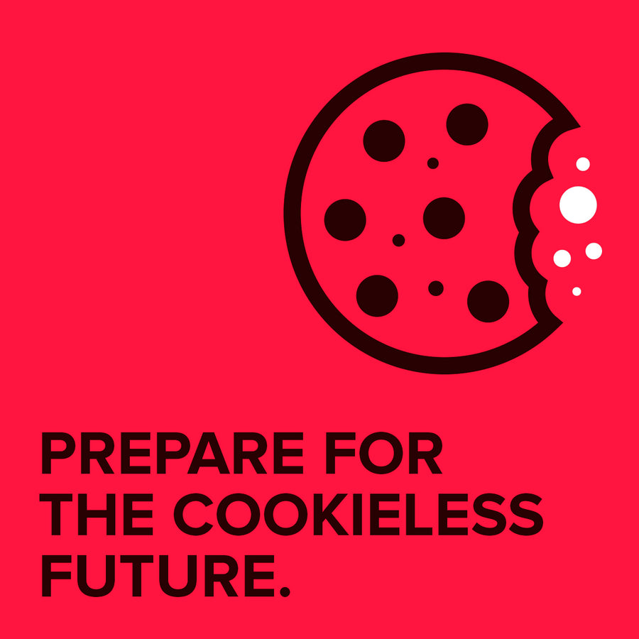
Preparing for a Cookieless Future: Maximising First-Party Data for Your eCommerce Site
CASE STUDIES

Coffee Central
Discover how Coffee Central streamlined their ordering and service process with a custom web app. Learn how it simplifies reordering, speeds up service requests, and boosts customer satisfaction.
-
App -
-
Magento

Floor Giants
Discover how Absolute helped Floor Giants boost customer engagement and streamline their Magento store. Learn about the key features that made the difference.
-
Magento
CONTACT

Are you excited to get your next project up and running? Or are you unsure what is dragging you down?
Contact Us to discuss how we can help increase sales and boost your online performance!
