

The Ins and Outs of Typography
There’s no such thing as a bad font - just its application!
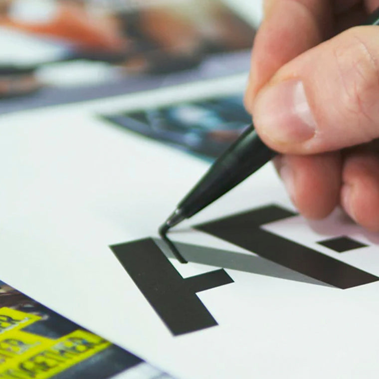
Typography is a fundamental aspect of design that encompasses more than just choosing fonts. It involves arranging letters, characters and text elements in a way that not only ensures readability but also to enhance to the overall aesthetics and effectiveness of the design.
The implementation of typography can profoundly influence how readers perceive and interact with content, making it a crucial consideration in various forms of communication from print materials to digital media.
Sourcing Fonts and Key Considerations
Where to obtain fonts:
Free Font Websites: Websites like Google Fonts, Dafont and Font Squirrel offer a wide selection of free and high-quality fonts. These platforms categorise fonts and provide search filters to help you find the right typefaces for your project quickly and easily.
Commercial Font Foundries: Commercial font foundries design and sell high-quality fonts. Websites like MyFonts, Fonts.com and Linotype offer a vast collection of fonts for purchase. These fonts are professionally designed and can be a great option for unique and specialised designs. But they can be quite expensive, especially if you need a licence which allows you to use it both online and offline.
Font Subscription Services: Some platforms offer font subscription services, such as Adobe Fonts with an Adobe Creative Cloud subscription. These services provide access to a large library of fonts as part of your subscription.
Keep in mind that while there are many free fonts available, investing in high-quality commercial fonts can add a unique and professional touch to your designs.
Font licensing:
When downloading and using fonts, it's important to consider the licensing terms associated with each font. Some fonts are free for both personal and commercial use, while others might have specific usage restrictions or require a licence for commercial projects. Always check the licensing information provided by the font source to ensure you're using the fonts appropriately. However, don't think you can get away with using the wrong licence, the internet is clever, websites can be scanned, and if you are caught using an incorrect licence, you may be fined.
Deciphering Font Terminology and Important Aspects
Font Selection: Align your font choices with your design's tone and objective. There are two main categories of fonts: serif and sans-serif. Serif fonts have small decorative strokes which can add character, while sans-serif fonts don’t have these strokes and are clean and more suited to body copy. Another category of fonts is Display fonts which can be used for headings and titles but should be used sparingly for readability.
Hierarchy: Establish a clear visual order by varying font sizes, weights, and styles. Use larger and bolder fonts for headings and important elements, and smaller fonts for body text and secondary information.
Contrast: Contrast between fonts creates visual interest and helps guide the viewer's eye. Contrast can be achieved through variations in size, weight, style, and colour.
Line Spacing (Leading): Leading refers to the vertical spacing between lines of text. Proper line spacing ensures readability and prevents the text from appearing too crowded or to spread out. As a rule of thumb depending on what font you are using, a good guide to follow is 8pt/12 leading.
Kerning and Tracking: Kerning adjusts the horizontal spacing between individual characters, while tracking adjusts the overall spacing between groups of characters. Proper kerning and tracking improve the readability and aesthetics of the text. However, if you are using a well-designed font, the spacing in between the letters will have already been considered, so playing around with the kerning can have a negative effect with its appearance.
Consistency: Maintain consistent typography throughout your design to create a cohesive and professional look. Consistency includes using the same fonts, sizes, and styles across different sections.
Context: Consider the context in which your typography will be used. Different contexts, such as print materials, websites, or mobile apps, might require adjustments to font size and style for optimal readability.
White Space: Incorporate enough white space around your text to prevent overcrowding and make the content more digestible.
Conclusion
Typography is a pivotal component of design, playing a vital role in shaping content perception and interaction. While the journey begins with selecting the appropriate font, it extends to its judicious application, considering aspects like hierarchy, contrast, and spacing. Whether you're opting for free fonts or investing in commercial ones, understanding licensing is paramount to avoid legal pitfalls.
Absolute Design is a leading branding agency and graphic design agency based in Nottingham. If you think your print material is in need of an overhaul, please get in touch.
CONTACT

Do you need help with graphic design?
We have a team of experienced graphic designers who are experts in creating high-quality, professional-looking designs. We'll work with you to understand your needs and goals, and then we'll create a design that exceeds your expectations.
Contact us today to learn more about our graphic design services.
